I tried to find some control templates or solutions for this problem on internet, but I didn’t find any “acceptable” solution for me. So I wrote it in my way and here is an example of my first (and last=)) attempt to do it:
<Window x:Class="TabControlTemplate.Window1"
    xmlns="http://schemas.microsoft.com/winfx/2006/xaml/presentation"
    xmlns:x="http://schemas.microsoft.com/winfx/2006/xaml"
    xmlns:src="clr-namespace:TabControlTemplate"
    Title="Window1" Width="600" Height="400">
<Window.Background>
    <LinearGradientBrush StartPoint="0,0" EndPoint="1,1">
        <GradientStop Color="#FF3164a5" Offset="1"/>
        <GradientStop Color="#FF8AAED4" Offset="0"/>
    </LinearGradientBrush>
</Window.Background>
<Window.Resources>
    <src:ContentToPathConverter x:Key="content2PathConverter"/>
    <src:ContentToMarginConverter x:Key="content2MarginConverter"/>

    <SolidColorBrush x:Key="BorderBrush" Color="#FFFFFFFF"/>
    <SolidColorBrush x:Key="HoverBrush" Color="#FFFF4500"/>
    <LinearGradientBrush x:Key="TabControlBackgroundBrush" EndPoint="0.5,0" StartPoint="0.5,1">
        <GradientStop Color="#FFa9cde7" Offset="0"/>
        <GradientStop Color="#FFe7f4fc" Offset="0.3"/>
        <GradientStop Color="#FFf2fafd" Offset="0.85"/>
        <GradientStop Color="#FFe4f6fa" Offset="1"/>
    </LinearGradientBrush>
    <LinearGradientBrush x:Key="TabItemPathBrush" StartPoint="0,0" EndPoint="0,1">
        <GradientStop Color="#FF3164a5" Offset="0"/>
        <GradientStop Color="#FFe4f6fa" Offset="1"/>
    </LinearGradientBrush>

    <!-- TabControl style -->
    <Style x:Key="TabControlStyle" TargetType="{x:Type TabControl}">
        <Setter Property="BorderThickness" Value="1"/>
        <Setter Property="Template">
            <Setter.Value>
                <ControlTemplate TargetType="TabControl">
                    <Grid>
                        <Grid.RowDefinitions>
                            <RowDefinition Height="Auto"/>
                            <RowDefinition Height="*"/>
                        </Grid.RowDefinitions>
                        <Border Grid.Row="1" BorderThickness="2,0,2,2" Panel.ZIndex="2" CornerRadius="0,0,2,2"
                                BorderBrush="{StaticResource BorderBrush}"
                                Background="{StaticResource TabControlBackgroundBrush}">
                            <ContentPresenter ContentSource="SelectedContent"/>
                        </Border>
                        <StackPanel Orientation="Horizontal" Grid.Row="0" Panel.ZIndex="1" IsItemsHost="true"/>
                        <Rectangle Grid.Row="0" Height="2" VerticalAlignment="Bottom"
                                   Fill="{StaticResource BorderBrush}"/>
                    </Grid>
                </ControlTemplate>
            </Setter.Value>
        </Setter>
    </Style>
    <!-- TabItem style -->
    <Style x:Key="{x:Type TabItem}" TargetType="{x:Type TabItem}">
        <Setter Property="SnapsToDevicePixels" Value="True"/>
        <Setter Property="Template">
            <Setter.Value>
                <ControlTemplate TargetType="TabItem">
                    <Grid x:Name="grd">
                        <Path x:Name="TabPath" StrokeThickness="2"
                              Margin="{Binding ElementName=TabItemContent, Converter={StaticResource content2MarginConverter}}"
                              Stroke="{StaticResource BorderBrush}"
                              Fill="{StaticResource TabItemPathBrush}">
                            <Path.Data>
                                <PathGeometry>
                                    <PathFigure IsClosed="False" StartPoint="1,0"
                                                Segments="{Binding ElementName=TabItemContent, Converter={StaticResource content2PathConverter}}">
                                    </PathFigure>
                                </PathGeometry>
                            </Path.Data>
                            <Path.LayoutTransform>
                                <ScaleTransform ScaleY="-1"/>
                            </Path.LayoutTransform>
                        </Path>
                        <Rectangle x:Name="TabItemTopBorder" Height="2" Visibility="Visible"
                                   VerticalAlignment="Bottom" Fill="{StaticResource BorderBrush}"
                                   Margin="{Binding ElementName=TabItemContent, Converter={StaticResource content2MarginConverter}}" />
                        <ContentPresenter x:Name="TabItemContent" ContentSource="Header"
                                          Margin="10,2,10,2" VerticalAlignment="Center"
                                          TextElement.Foreground="#FF000000"/>
                    </Grid>
                    <ControlTemplate.Triggers>
                        <Trigger Property="IsMouseOver" Value="True" SourceName="grd">
                            <Setter Property="Stroke" Value="{StaticResource HoverBrush}" TargetName="TabPath"/>
                        </Trigger>
                        <Trigger Property="Selector.IsSelected" Value="True">
                            <Setter Property="Fill" TargetName="TabPath">
                                <Setter.Value>
                                    <SolidColorBrush Color="#FFe4f6fa"/>
                                </Setter.Value>
                            </Setter>
                            <Setter Property="BitmapEffect">
                                <Setter.Value>
                                    <DropShadowBitmapEffect Direction="302" Opacity="0.4"
                                                        ShadowDepth="2" Softness="0.5"/>
                                </Setter.Value>
                            </Setter>
                            <Setter Property="Panel.ZIndex" Value="2"/>
                            <Setter Property="Visibility" Value="Hidden" TargetName="TabItemTopBorder"/>
                        </Trigger>
                    </ControlTemplate.Triggers>
                </ControlTemplate>
            </Setter.Value>
        </Setter>
    </Style>
</Window.Resources>
<Grid Margin="20">
    <TabControl Grid.Row="0" Grid.Column="1" Margin="5" TabStripPlacement="Top"
                Style="{StaticResource TabControlStyle}" FontSize="16">
        <TabItem Header="MainTab">
            <Border Margin="10">
                <TextBlock Text="The quick brown fox jumps over the lazy dog."/>
            </Border>
        </TabItem>
        <TabItem Header="VeryVeryLongTab" />
        <TabItem Header="Tab" />
    </TabControl>
</Grid>
using System;
using System.Windows;
using System.Windows.Controls;
using System.Windows.Data;
using System.Windows.Media;

namespace TabControlTemplate
{
public partial class Window1
{
    public Window1()
    {
        InitializeComponent();
    }
}

public class ContentToMarginConverter: IValueConverter
{
    #region IValueConverter Members

    public object Convert(object value, Type targetType, object parameter, System.Globalization.CultureInfo culture)
    {
        return new Thickness(0, 0, -((ContentPresenter)value).ActualHeight, 0);
    }

    public object ConvertBack(object value, Type targetType, object parameter, System.Globalization.CultureInfo culture)
    {
        throw new NotImplementedException();
    }

    #endregion
}

public class ContentToPathConverter: IValueConverter
{
    #region IValueConverter Members

    public object Convert(object value, Type targetType, object parameter, System.Globalization.CultureInfo culture)
    {
        var ps = new PathSegmentCollection(4);
        ContentPresenter cp = (ContentPresenter)value;
        double h = cp.ActualHeight > 10 ? 1.4 * cp.ActualHeight : 10;
        double w = cp.ActualWidth > 10 ? 1.25 * cp.ActualWidth : 10;
        ps.Add(new LineSegment(new Point(1, 0.7 * h), true));
        ps.Add(new BezierSegment(new Point(1, 0.9 * h), new Point(0.1 * h, h), new Point(0.3 * h, h), true));
        ps.Add(new LineSegment(new Point(w, h), true));
        ps.Add(new BezierSegment(new Point(w + 0.6 * h, h), new Point(w + h, 0), new Point(w + h * 1.3, 0), true));
        return ps;
    }

    public object ConvertBack(object value, Type targetType, object parameter, System.Globalization.CultureInfo culture)
    {
        throw new NotImplementedException();
    }

    #endregion
}
}
These two converters I wrote to adjust tab size to its content. Actually, I making Path object depending on content size. If you don’t need tabs with various widths, you can use some modified copy of this:
<Style x:Key="tabPath" TargetType="{x:Type Path}">
      <Setter Property="Stroke" Value="Black"/>
      <Setter Property="Data">
          <Setter.Value>
              <PathGeometry Figures="M 0,0 L 0,14 C 0,18 2,20 6,20 L 60,20 C 70,20 80,0 84,0"/>
          </Setter.Value>
      </Setter>
  </Style>
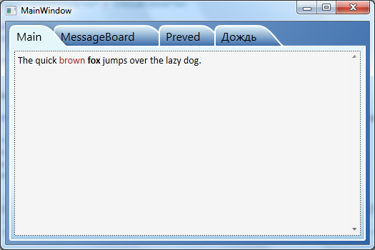
screen:
sample project(vs2010)